Why Is Scandi Design a Good Choice for Aparthotels?

Because it blends functionality, comfort, and timeless style—perfect for modern guest expectations.


In the ever-evolving hospitality sector, aparthotels are rapidly gaining popularity across the UK. Combining the convenience of a hotel with the flexibility of a serviced apartment, they cater to business travellers, digital nomads, families, and long-stay guests. To meet these diverse needs, interior design must balance style, comfort, and practicality—and that’s where Scandinavian (Scandi) design truly excels.

Rooted in simplicity, warmth, and purposeful living, Scandi interiors are the ideal match for aparthotel environments. They not only enhance guest satisfaction but also support operational efficiency and long-term value for developers and operators alike.


Calm, Comfortable, and Inviting

At the heart of Scandi design is the concept of hygge—a Danish word that loosely translates as a sense of cosy contentment. In aparthotels, where guests may be staying for days or even weeks, this feeling of home-from-home comfort is essential. Neutral tones, soft textures, and uncluttered layouts help create calming interiors where guests can relax, work, or entertain with ease.

Natural light is also a key component of Scandi interiors. By maximising daylight with sheer window treatments, light wood finishes, and clean colour palettes, rooms feel brighter, bigger, and more welcoming—an important consideration for compact urban aparthotel spaces.


Functionality Without Sacrificing Style

Aparthotel guests expect both beauty and utility. Scandi design meets that demand with its well-known focus on form following function. Every element serves a purpose: furniture is often modular or multi-functional, storage is discreet but abundant, and kitchens are minimalist yet fully equipped.

This is particularly valuable for operators aiming to optimise limited space without compromising on guest experience. Whether it’s a fold-out dining table, wall-mounted shelving, or integrated lighting, Scandi interiors provide clever solutions that feel seamless and considered.


Timeless and Cost-Effective

Scandinavian design’s enduring popularity also makes it a smart long-term investment. Unlike trend-driven styles that may feel dated within a few years, Scandi interiors rely on timeless materials and muted palettes that age well. Oak flooring, white walls, and simple ceramic finishes offer a clean canvas that’s easy to update or personalise with seasonal accessories.

For aparthotel brands expanding across multiple locations, this design consistency is key. A Scandi-inspired design language can be replicated and scaled efficiently, helping to establish a cohesive and recognisable identity across sites.


Sustainability Matters

Sustainability is another reason why Scandi design is so well-suited to the UK aparthotel market. With growing consumer demand for eco-conscious travel options, interiors that use natural materials, low-impact finishes, and durable craftsmanship align with both guest expectations and ESG goals. Scandinavian design has long embraced sustainability as a core principle, offering style that doesn't cost the earth.


In summary, Scandi design works beautifully for aparthotels because it balances comfort, functionality, and enduring appeal. Whether you’re designing a single unit or an entire development, its focus on calm living and smart use of space delivers a guest experience that feels both premium and personal.


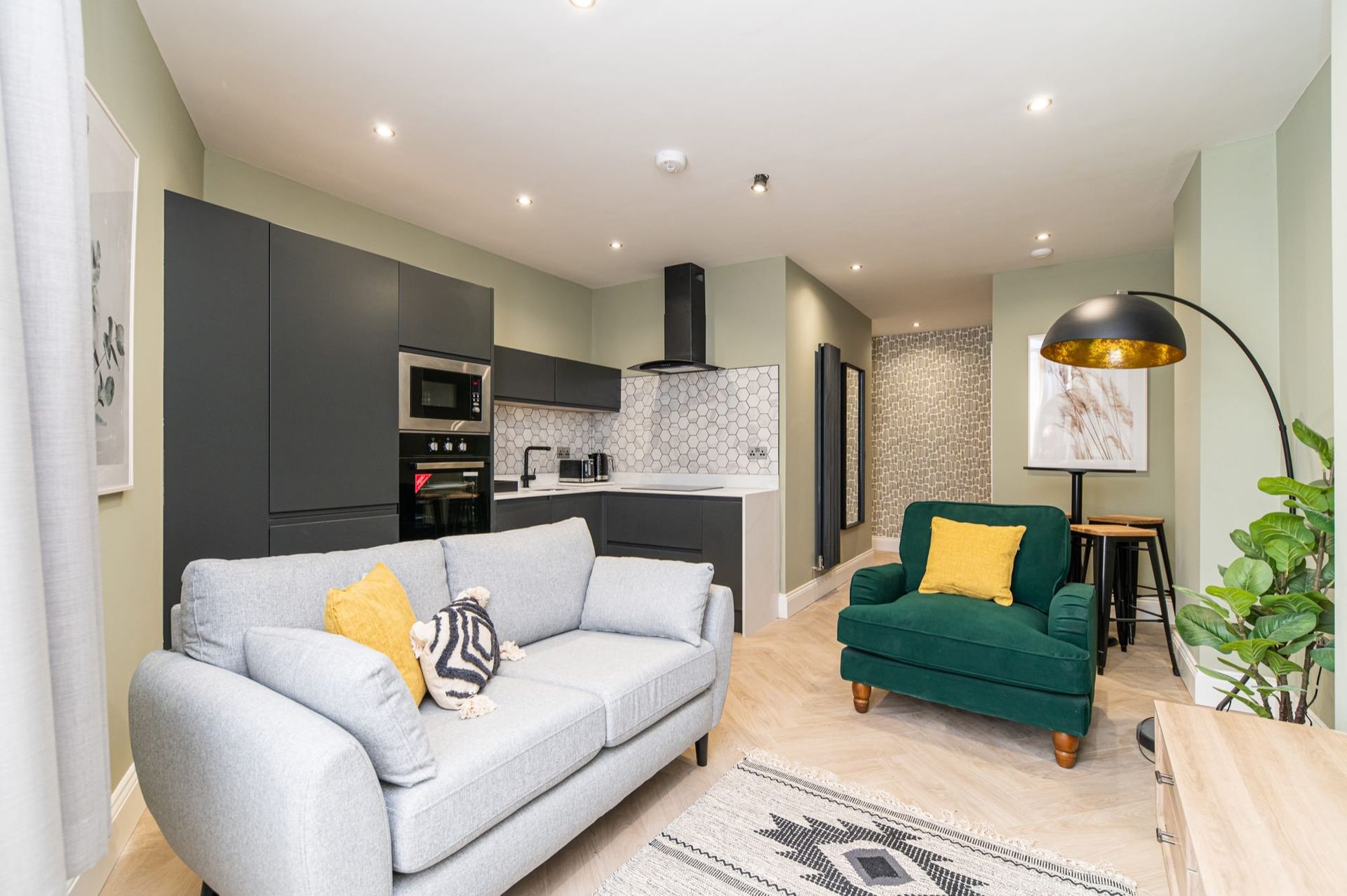
We used this approach when designing the interiors for Chelmsford Lofts, an AppartHotel based just outside Newcastle Upon Tyne’s city centre.


Recommended Reading


“Scandinavian Design Trends for 2025” – The Modern Dane

Exploring fresh Nordic trends including rich earthy colours, sustainable materials, and multifunctional furniture https://uk.moderndane.com/blogs/the-modern-dane-blog/scandinavian-design-trends-for-2025


"Hotel AKA Boston Common Reveals a Refreshed Design"  - Hospitality Design magazine,

AKA has unveiled the redesign of Hotel AKA Boston Common, a 190-room property that underwent a transformation

https://hospitalitydesign.com/news/hotels-resorts/hotel-aka-boston-common-redesign/


July 21, 2025
We were commissioned by Ken Speckle , a new premium confectionery brand based in Northumberland, to design packaging for their debut range — a collection of handmade treats with heritage at their core and a bold, modern outlook. The brief was clear: create something design-led, eye-catching, and unashamedly contemporary. Ken Speckle wanted to move beyond the traditional luxury aesthetic — no gold foils, cursive scripts, or overly precious motifs — and instead bring a fresh, confident energy to the confectionery aisle. And that’s exactly what we set out to do. Rooted in Craft, Designed for Now Ken Speckle may be new to the market, but their approach is steeped in the tradition of quality British confectionery. Made in small batches with care and attention, their products needed packaging that reflected that craft, without feeling nostalgic or overly safe. From the outset, we focused on creating a visual identity that felt bold and distinctive. We explored how to channel the character of Northumberland — its rugged landscapes, its independent spirit — into a design language that would feel relevant to a new generation of consumers. The final packaging is graphic, modern, and full of personality. We developed a system based on strong geometric forms, confident typography, and a vibrant colour palette that shifts away from the muted tones typically associated with premium treats. Each flavour has its own colour story, helping the range stand out individually and as a collection. A Modern Take on Premium Rather than leaning on clichés of luxury, we aimed for something more current: a brand that feels design-savvy, trustworthy, and joyful. The materials were carefully selected for their sustainability and tactile quality, adding depth without relying on obvious luxury finishes. We also paid close attention to the unboxing moment — that pause before the first taste. The result is packaging that feels considered and well-crafted, but never overworked or overly precious. It’s premium with a playful edge. Heritage with a Twist Heritage-rich brands today are finding strength by celebrating their stories—but doing so in a way that resonates with modern audiences. Ken Speckle’s Northumberland origin is integrated subtly into the packaging’s design logic, not as pastiche but as authentic character. The result is packaging that feels grounded in place, yet looks anything but traditional. It’s a confident, contemporary statement. Standing Out with Substance This project proves that premium packaging doesn’t have to be predictable and is a great example of how design can help a brand carve out a distinct space in a crowded market. Ken Speckle may be rooted in the Northeast, but their vision is anything but parochial. Their range is ambitious, full of flavour, and ready to disrupt expectations — and the packaging reflects that. We’re proud to have helped shape their launch, as Ken Speckle’s debut range is rooted in tradition but speaks directly to today’s design- and quality-conscious consumers. And in a crowded market, the sweetest thing you can do is stand out. Click to see our full Ken Speckle branding and package design Further Reading: The top 4 packaging trends in confectionery in 2024 - Confectionery News The Role of Food Packaging Design in Enhancing Premium Food Brands - Green Seed Group How 3 heritage brands use packaging design to celebrate their cultural roots - New Hope Network
July 10, 2025
Discover how digital apps inspired by playhouses are sparking creativity, storytelling, and imaginative play in children – bridging physical fun with digital magic.
Panda Babies
July 10, 2025
Discover how digital apps inspired by playhouses are sparking creativity, storytelling, and imaginative play in children – bridging physical fun with digital magic.
The interior of Henson Motor Group's interior
July 9, 2025
Acoustic dampening is vital in large sales areas like car showrooms. Improve customer experience, reduce noise, and boost your brand with expert interior design across the UK.
Henson Motor Group Branding On Building Exterior
July 4, 2025
Bold graphics help contemporary brands stand out, build recognition, and communicate with clarity. Discover why bold design works in today’s market.
Industrial Interior Design for Hospitality | UK Experts
July 4, 2025
Explore why industrial interior design works for UK hospitality venues—offering style, durability, and a unique guest experience in modern spaces.