Reimagining a Classic: Bold Packaging for a New Era of Confectionery
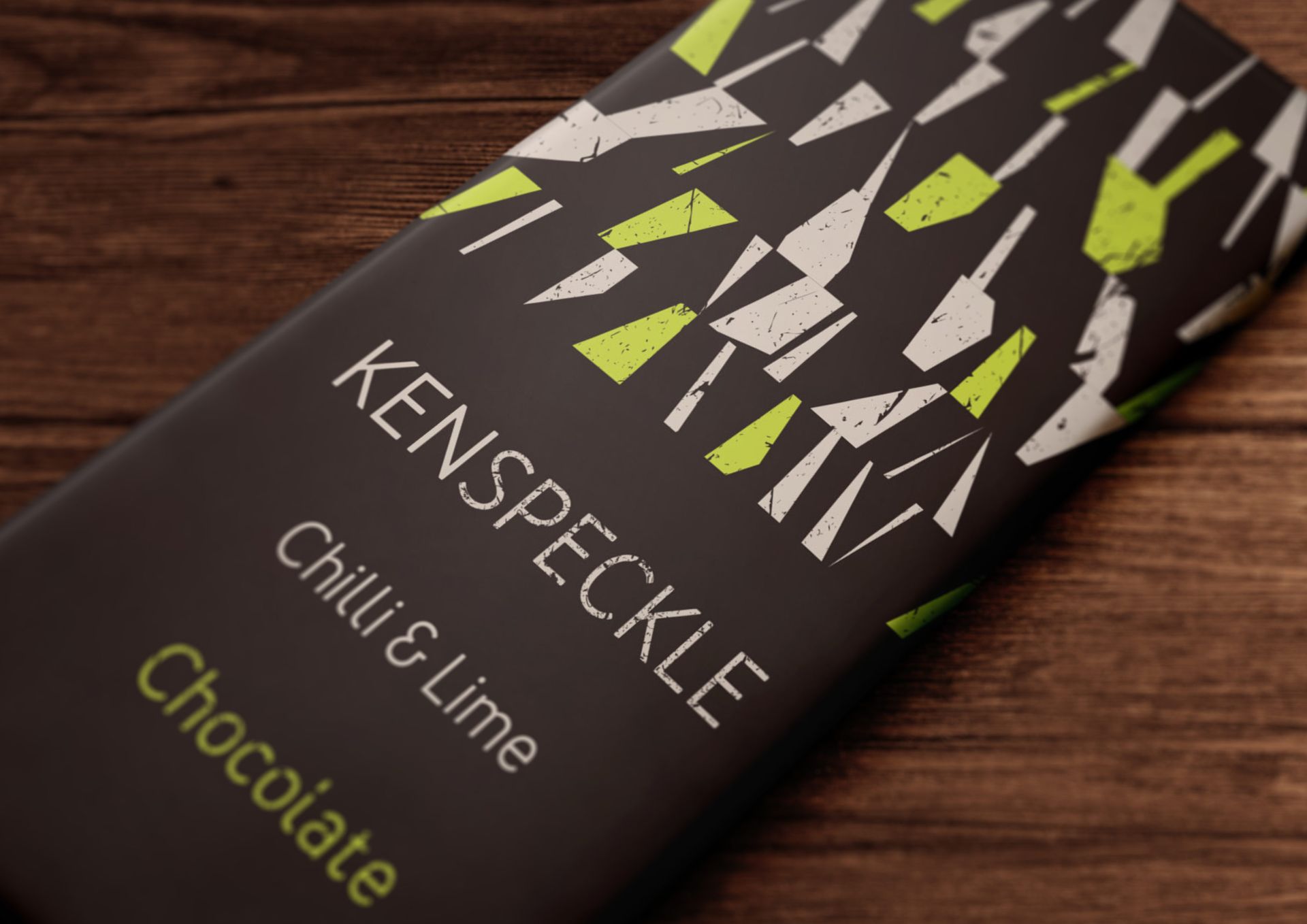
We were commissioned by Ken Speckle, a new premium confectionery brand based in Northumberland, to design packaging for their debut range — a collection of handmade treats with heritage at their core and a bold, modern outlook.
The brief was clear: create something design-led, eye-catching, and unashamedly contemporary. Ken Speckle wanted to move beyond the traditional luxury aesthetic — no gold foils, cursive scripts, or overly precious motifs — and instead bring a fresh, confident energy to the confectionery aisle.
And that’s exactly what we set out to do.
Rooted in Craft, Designed for Now
Ken Speckle may be new to the market, but their approach is steeped in the tradition of quality British confectionery. Made in small batches with care and attention, their products needed packaging that reflected that craft, without feeling nostalgic or overly safe.
From the outset, we focused on creating a visual identity that felt bold and distinctive. We explored how to channel the character of Northumberland — its rugged landscapes, its independent spirit — into a design language that would feel relevant to a new generation of consumers.
The final packaging is graphic, modern, and full of personality. We developed a system based on strong geometric forms, confident typography, and a vibrant colour palette that shifts away from the muted tones typically associated with premium treats. Each flavour has its own colour story, helping the range stand out individually and as a collection.
A Modern Take on Premium
Rather than leaning on clichés of luxury, we aimed for something more current: a brand that feels design-savvy, trustworthy, and joyful. The materials were carefully selected for their sustainability and tactile quality, adding depth without relying on obvious luxury finishes.
We also paid close attention to the unboxing moment — that pause before the first taste. The result is packaging that feels considered and well-crafted, but never overworked or overly precious. It’s premium with a playful edge.
Heritage with a Twist
Heritage-rich brands today are finding strength by celebrating their stories—but doing so in a way that resonates with modern audiences.
Ken Speckle’s Northumberland origin is integrated subtly into the packaging’s design logic, not as pastiche but as authentic character.
The result is packaging that feels grounded in place, yet looks anything but traditional. It’s a confident, contemporary statement.
Standing Out with Substance
This project proves that premium packaging doesn’t have to be predictable and is a great example of how design can help a brand carve out a distinct space in a crowded market.
Ken Speckle may be rooted in the Northeast, but their vision is anything but parochial. Their range is ambitious, full of flavour, and ready to disrupt expectations — and the packaging reflects that.
We’re proud to have helped shape their launch, as Ken Speckle’s debut range is rooted in tradition but speaks directly to today’s design- and quality-conscious consumers. And in a crowded market, the sweetest thing you can do is stand out.
Click to see our full Ken Speckle branding and package design
Further Reading:
The top 4 packaging trends in confectionery in 2024 - Confectionery News
The Role of Food Packaging Design in Enhancing Premium Food Brands - Green Seed Group
How 3 heritage brands use packaging design to celebrate their cultural roots - New Hope Network